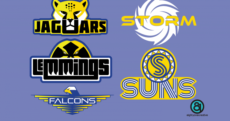
Spot anything different on this website recently?
As you may have seen, there has been a few updates to the website during the off-season in preparation for another year on the court.
One that you will be able to see on the website is the designing of some new team logos!
The five new logos have been designed to complement the current existing club logo and were the brainchild of local freelancer illustrator and graphic designer, Daryl Harvey of eightyonecreative.
Speaking about the concept around the logo design, Daryl said
‘The brief I was given in designing the new logos was to incorporate the team name into a graphic which was in-keeping with the current club logo and have an ‘Aztecs-feel’ about them. The colour scheme also had to be in keeping with the current logo’
Daryl continued:
‘I then went about researching Aztec styles and developed a few concept sketches which I shared with Chris and the committee at the time. They made a few proposals, which I agreed with and updated the designs appropriately. I’m really happy with how the final designs came out!’
Chris Giles, who commissioned Daryl to complete the designs stated:
‘We have a great club here and we have over recent years been trying to improve the online presence of club through our social media presence and updating the website.
I have known Daryl for many, many years and knew that he would be the person to help do this… The designs look great and we are really happy with Daryl’s work!’
The logos will primarily be used in online and in any general marketing but we are also open to the idea of having team-branded clubwear as well if that is something that appeals, leave a comment below.
If anyone is interested in using Daryl’s services for any of your design needs, feel free to reach out to him via email or follow him onInstagram or Twitter



Leave a Comment